A 150-million-euro station
After ten years building and 150 million euros Amsterdam finally has a new and imposing station in Zuidoost, the southeast of the city. The first of a new generation of stations that are to be built in the Netherlands in the coming years.
Amsterdam Zuidoost is to be developed as a new centre for Amsterdam. Major recreational programmes that are not suitable for the inner city, such as the ArenA Stadium, the Heineken Music Hall and a furniture mall, are to be concentrated in this part of the city. With its narrow underground passage and two small platforms, the old 1976 Bijlmerstation does not fit into this vision. In 1998 the doubling of the railway track (between Utrecht and Amsterdam) and the construction of the Utrechtboog flyover railway line were the springboard for realizing a new and striking station. A station that can cope with the extra passengers.
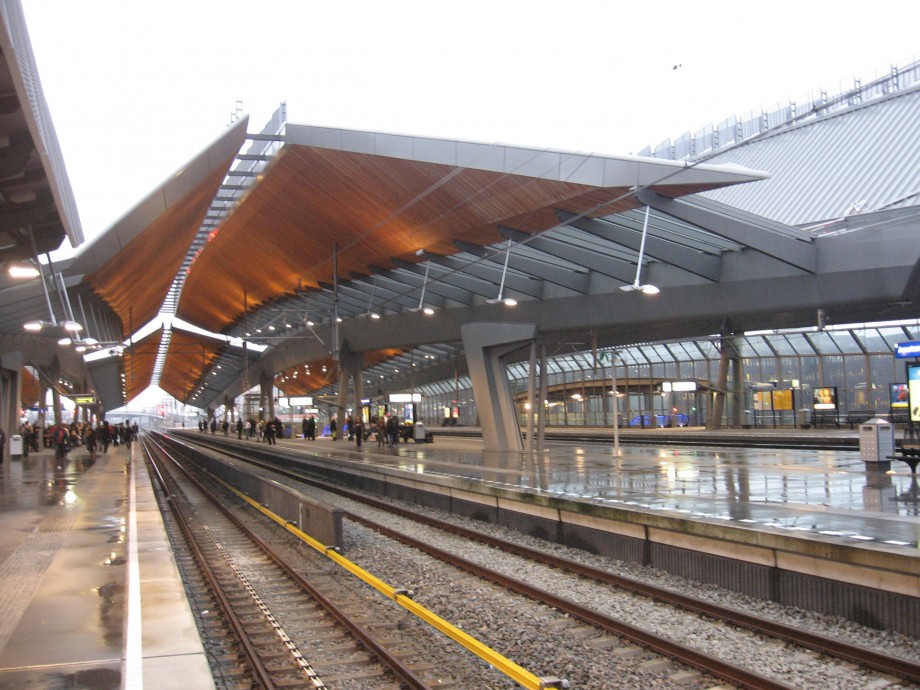
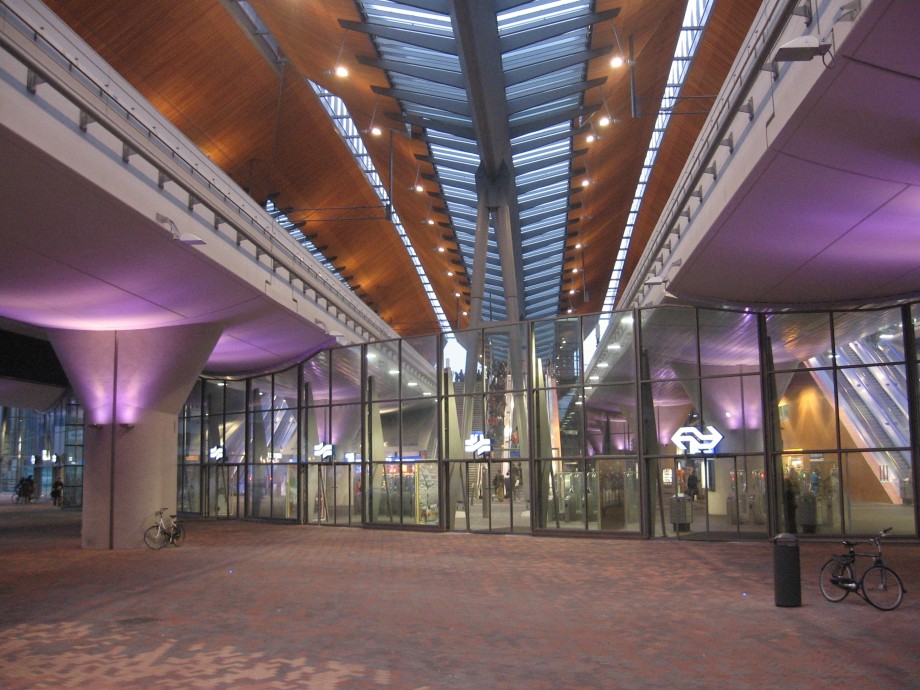
The design by Grimshaw Architects (architect Neven Sidor) and ARCADIS Architecten (architect Jan van Belkum) is easy to describe. The station is made up of several freestanding components which, although clearly recognizable as such, together form a single design entity. The old underground passage, a continuation of the ArenA boulevard connecting the centre of Bijlmer and Amsterdam Zuidoost, was widened and made higher (now 70 metres wide and 7 metres high). As many openings as possible were left between the railway viaducts to allow light in and provide visual connectivity. The underground passage now has a very friendly resonance and much care has been taken over the lighting. The roof enclosure of the station is structurally entirely independent of the tracks. The roof has an unusual vaulting spanning the entire length and only interrupted where it is staggered where it intersects the path of the boulevard. Although the majority of passengers would not notice this, it makes the roof just that bit more exciting than if there were a continuous span. Indeed if you are standing on the Utrecht side you do not see the interruption and the vaulting lacks interest. The roof construction is remarkable for its detail. Rather than the box-beams so popular in the eighties, use has been made of massive steel, dark-grey girders. The roof itself is made up of ribbons of glazing and a ceiling of timber strips. The timber creates a contrast with the dark-grey steel girders and is beautifully lit at night. In addition to the use of timber, the ceiling is finished with metal slats. These metal slats return in the roof where, along the open spine of the roof (above the tracks), they have been installed upright making the exterior look like a prehistoric creature with armour-plating on its back.
As soon as you leave the station you notice how much the building has been designed from the inside out. On either side of the underground passage are extensions that are not in spirit with the rest of the station design. It seems as though the architect has literally run up against the site boundary. It is also not clear why the access stairs between the station platforms are suspended from the viaduct, while the stairs accessing the platforms at each end of the station are somewhat clumsily placed on concrete columns. The station platforms span the underground passage; the metro platform, which is situated in between the platforms, is shorter creating a double-height space in the middle of the station. On leaving the metro platform you immediately have a good overview of the station concourse below. But it is not a traditional station hall, the space is not clearly enclosed. However, to create a certain sense of a proper station concourse a piece of ground level has been encased under the viaducts by a glass wall, reminding me for all the world of a 7-metre high fence. To reinforce the detached nature, this wall (or rather fence) stops just short of the railway viaduct.
Speaking on the local Amsterdam television station AT5, the architect from Grimshaw Architects explained that the station will bring life to the area, promote social interaction and serve as a meeting place. To me that seems a somewhat optimistic prediction. The choice of materials and layout suggest that it is intended primarily as a vandalism, hooliganism and graffiti-proof building. In the places where people could come into contact with the material no risks have been taken in their use, instead easy to maintain materials such as glass, steel or ceramic tiles have been applied. And the security measures too suggest a high-risks soccer match rather than a relaxed encounter. Above all the access stairs security cameras are mounted ensuring that both arriving and departing passengers are under constant surveillance. The colours of the cameras show that the CCTV is neatly divided between the public transport company GVB (white) and the Dutch Railways (yellow). According to a spokesman for Prorail, the Amsterdam Bijlmer ArenA Station is the first of a new generation of stations. Food for thought! It is in fact a bleak station hardly offering any social space. Such social space as there is, is managed by commercial enterprises like Douwe Egberts and Albert Heijn. The station itself only bids one to leave the building as quickly as possible. It is no more than an interchange facility with a beautiful roof.
Post Scriptum:
In 2008 the station was awarded with a collection of prizes. The involved juries were probably taken aback by the beautiful roof and forgot to realize what a train station can be.
Published on 23/6/2009


